Category: Packaging
Go Grub
Packaging that takes you on a snacking adventure
- With Sukkrish Aadds
- Tags: Branding, Packaging
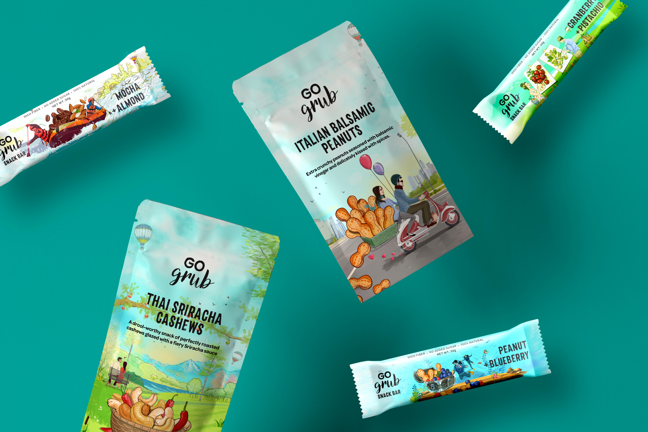
Go Grub is a Delhi based company that makes nutritious snacks for everyday consumption. Their product range lies across 3 broad categories – Cereals, snack bars and snack packs. They already had their product range ready & the only crucial thing they needed was – a brand storyline, perfect positioning and packaging that is reflective of that.
After being clear on the strategy for the assignment – we were sure that we had to tell the story of founders of Go Grub who had savoured food from across the world during their extensive travels. This meant the whole theme for it has to be tied around its mantra – Go On Indulge.
Bold typefaces, a packaging canvas coloured with lush greens and blues of our planet and two travellers in search of great adventures was imagined on the packaging. Untouched landscapes, mountain terrains and clamoured cities formed the backdrop of their travels and adventures. We finally had a guilt-free snacking product that transported consumers to a world full of magical flavours and adventures, with every bite.


Karam Dosa
Branding a restaurant on
the move
- With Sukkrish Aadds
- Tags: Branding, Space Design, Packaging
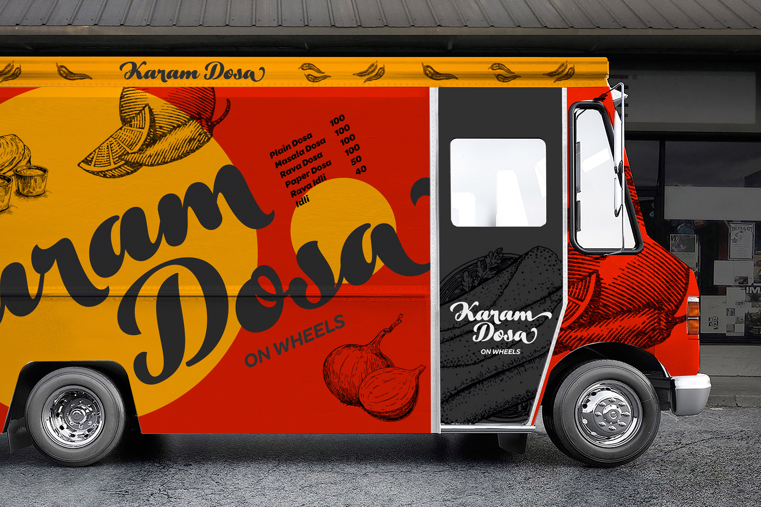
There is a truck snaking through the streets of Bengaluru. Wherever it halts, people gather around it for ‘Karam Dosa’.
Dosa is one of the most popular breakfast options in the whole world! The task at hand was to design the identity for the spicy dosa brand that Karam Dosa is. A stunning visual language on the truck that makes a striking impact even in the traffic mayhem was our vision.
The design makes use of bright, contrasting colours – an indelible red and an exquisite yellow. As unmistakable as the Rayalaseema karam (spicy).


Millet Might

How do you package a healthy alternative?
- With Sukkrish Aadds
- Tags: Packaging
To make consumers believe that eating a packet of millet might is akin to consuming a healthy meal, the client wanted to launch ragi-based biscuits as a healthy alternative to maize-based biscuits. The biscuits were meant for those who are health conscious but do not always have the time to cook up a healthy meal that’s tasty too. The biscuits were to be launched in 250gms packets.
The design inspiration was derived from the home kitchen because it’s there that food is made with absolute love and care. The packaging, thus, carries back-in-time kind of illustrations of millet, bringing back memories of mum’s cooking. In short, the solution included tying the brand with simple and honest emotions that we generally associate with the goodness of home-cooked food.


