Category: Brand Identity
Dash
Restaurant
& Bar
Branding a young and exciting venue
in Chennai
- With Sukkrish Aadds
- Tags: Branding, Communication, Print
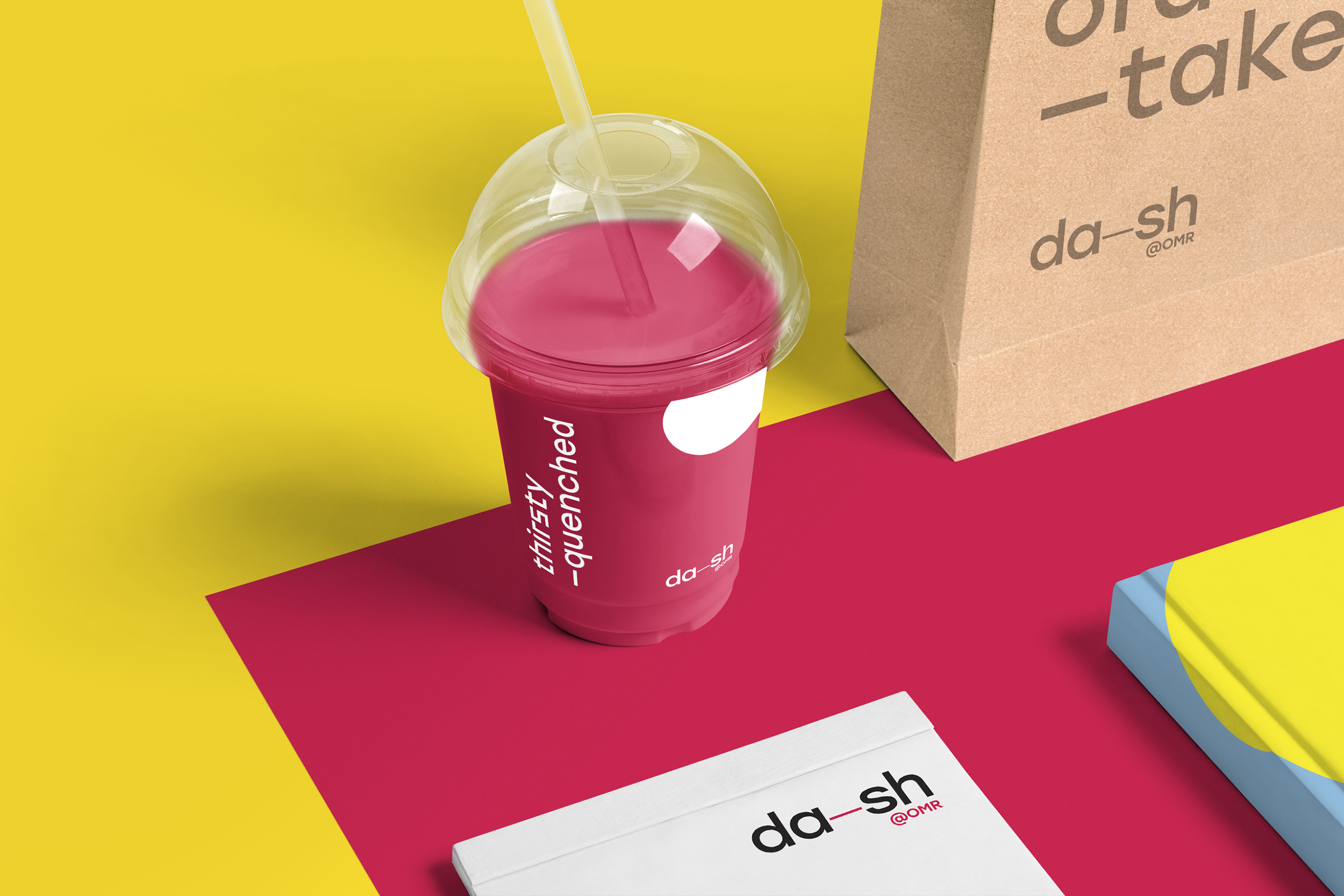
Dash is a four-storey destination located in Chennai’s IT hub, OMR (Old Mahabalipuram Road) offering dining and recreational options for a wide target demographic. The chief objective was to create a brand identity that aptly translated the fun and vibrant atmosphere Dash was striving to create.
A deeper understanding of the target audience led us to create a visual and verbal identity with a view to brevity and clarity. The brand language was convivial and the communication was immediate. We visualised Dash as a place where visitors can travel from one state of mind to another. We incorporated a dash (as in —) in the design to represent the transition.
Integrating the brand’s identity across various collateral and also in the space, proved to be experimental, rather than obvious. These began to layer into a playful design language, creating interesting visual & verbal expressions, spearheaded by emotive and enthusiastic copywriting. In the end, a pithy approach to Dash helped us create a wholesome and fulfilling brand experience.


Museum
of Art &
Photography
Branding a new museum in Bangalore
- At TSK Design
- Tags: Identity, Print, Communication
- Image Credits: Shamanth Patil for TSK Design
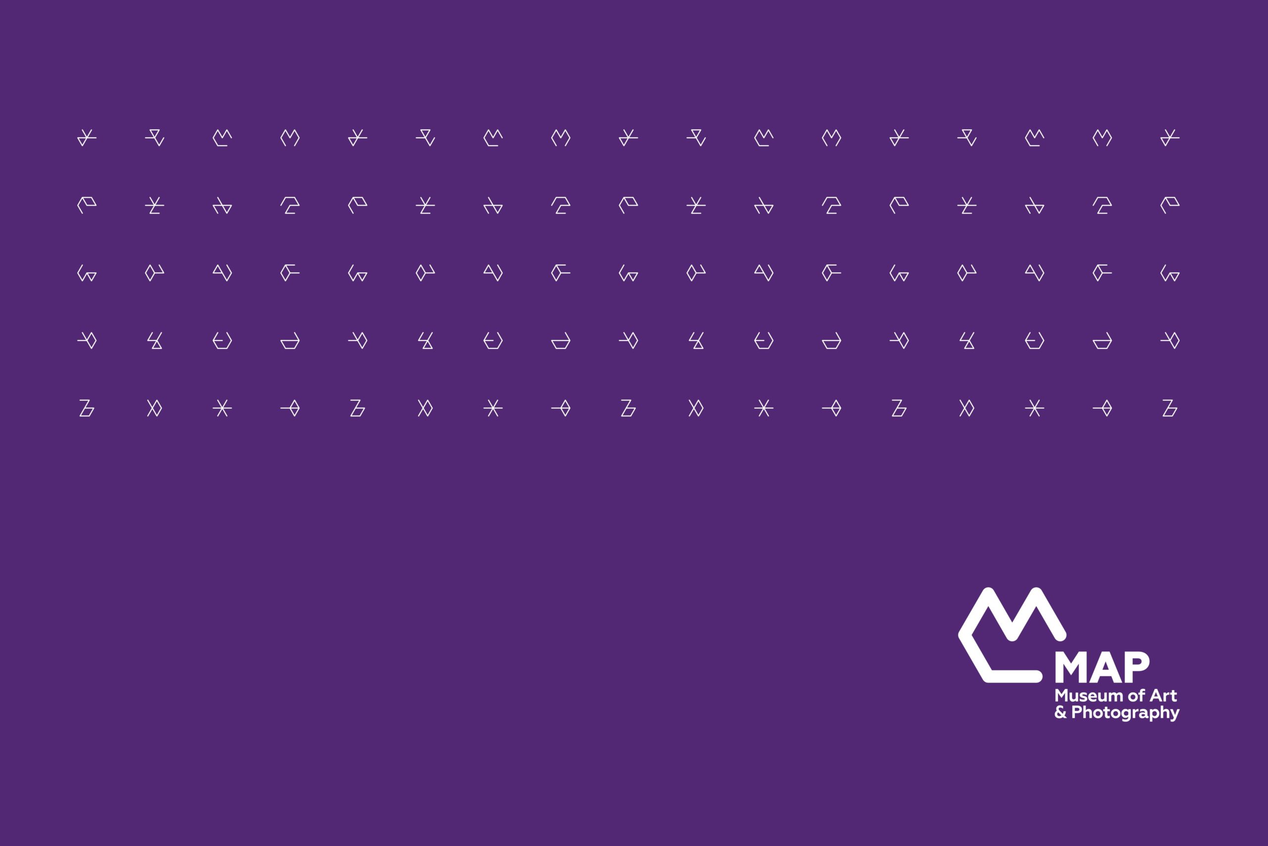
The Museum of Art & Photography (MAP) is a new museum in Bangalore comprising of a large and varied collection of Indian art, photography, textiles and design.
We were tasked to develop an identity for the museum with a focus on creating something exciting and approachable. With the identity, we wanted to change the idea of museums being viewed in the Indian context as formal, static institutions. This culminated in the creation of the MAP logo – an ‘M’ built on a hexagonal grid, which represents the museum’s collection across 6 disciplines.
In order to highlight MAP’s cross disciplinary approach, the same grid served as a foundation to a dynamic set of widgets that added an element of play to the brand. The minimalist style combined with a colour palette deeply rooted in Indian culture gives MAP a unique and distinct identity.


Sahara
Noon
Designing an identity for a luxury brand
- Tags: Branding, Identity, Calligraphy
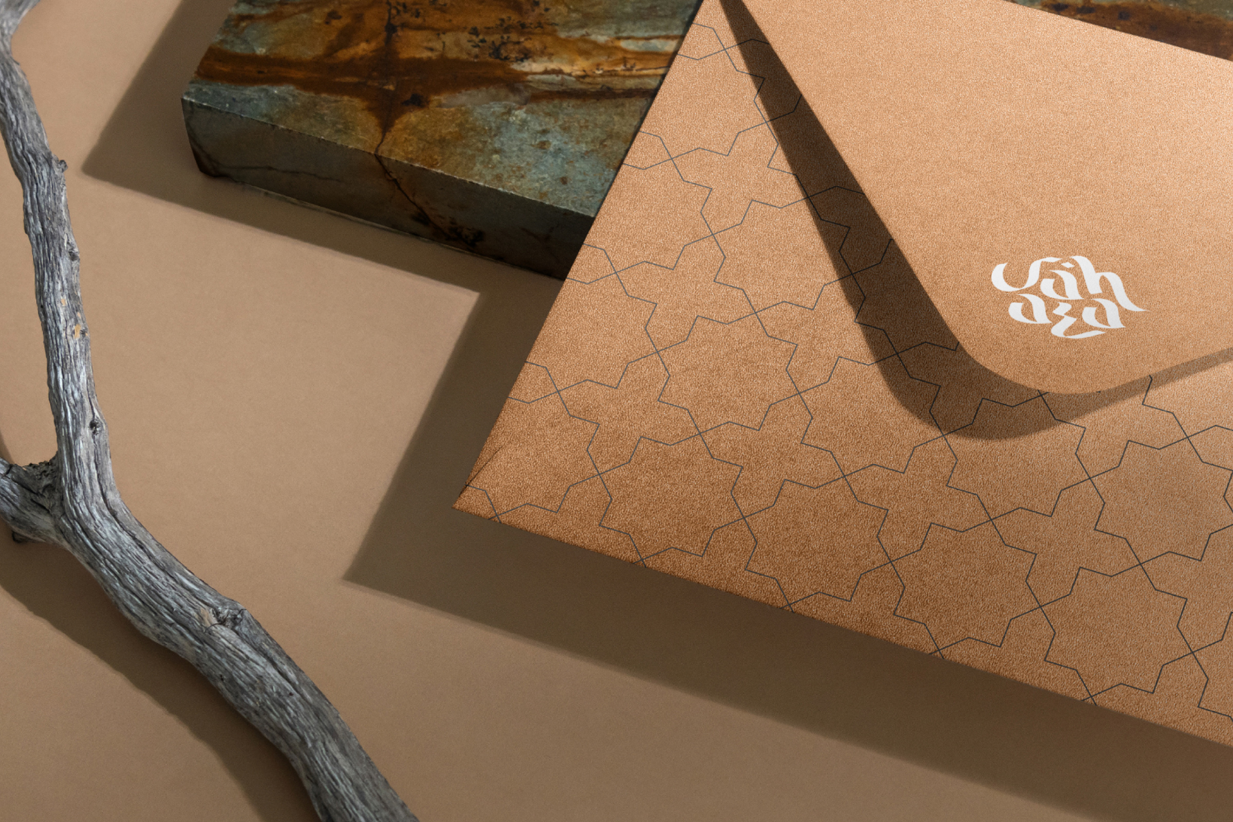
Sahara Noon is a luxury clothing and leather brand with a focus on genuine quality. Their products are sourced from and cater to a clientele spanning over Africa, Asia and parts of Europe.
The name ‘Sahara’ is entwined in flavours of Africa, but has an Arabic root, while ‘noon’ is a character in the Arabic alphabet. The logo thus needed to represent the brand’s Arabic heritage.
The result was a calligraphic logo with an Arabic feel to it. The use of gold, white and black, as brand colours, pay homage to the brand’s cultural roots, while giving a modern and sophisticated outlook. The inclusion of the ‘Jali’ pattern completes the overall makeup of the brand.
Through its hues and symbols, Sahara Noon invites you to experience the best of avant-garde fashion.


AHA! Theatre
for Children
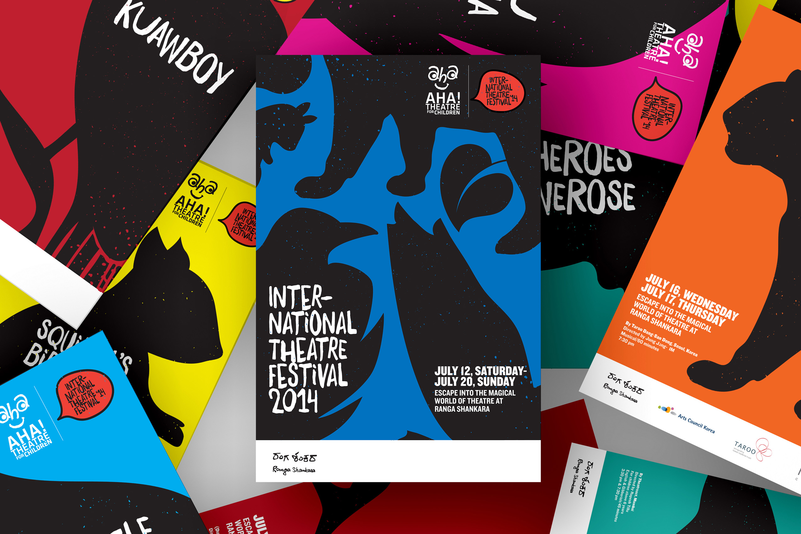
Designing posters for a Children’s Theatre Festival
- At TSK Design
- Tags: Identity, Print, Posters
Rangashankara is a dynamic cultural space that is dedicated to quality theatre and theatre arts. ‘Aha’ is Rangashankara’s brainchild that focuses on bringing the magic of theatre to children. This platform for children organizes an Annual Theatre Festival each year where this year’s theme revolved around animals and nature. Our task was to create individual posters for the series of plays featuring at the festival. Having made ourselves familiar with the plays, we set out on a journey to create something memorable and exciting.
We wanted the posters to be striking and playful at the same time. Hence, we decided to take the central theme for each play and create bold black illustrations out of the same. The illustrations were juxtaposed with bright colours and playful typography. The hand-written font felt perfect in terms of its resemblance to a child’s writing, without the issue of legibility.
Even though the design solution looks simple at first, the design achieved what it set out to do – condensing ideas into something memorable and unique.


Go Grub
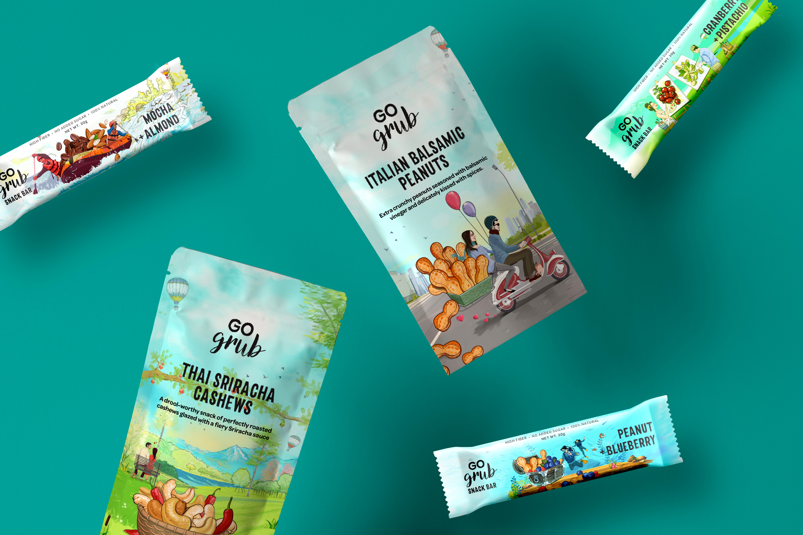
Packaging that takes you on a snacking adventure
- With Sukkrish Aadds
- Tags: Branding, Packaging
Go Grub is a Delhi based company that makes nutritious snacks for everyday consumption. Their product range lies across 3 broad categories – Cereals, snack bars and snack packs. They already had their product range ready & the only crucial thing they needed was – a brand storyline, perfect positioning and packaging that is reflective of that.
After being clear on the strategy for the assignment – we were sure that we had to tell the story of founders of Go Grub who had savoured food from across the world during their extensive travels. This meant the whole theme for it has to be tied around its mantra – Go On Indulge.
Bold typefaces, a packaging canvas coloured with lush greens and blues of our planet and two travellers in search of great adventures was imagined on the packaging. Untouched landscapes, mountain terrains and clamoured cities formed the backdrop of their travels and adventures. We finally had a guilt-free snacking product that transported consumers to a world full of magical flavours and adventures, with every bite.


HPYHRS
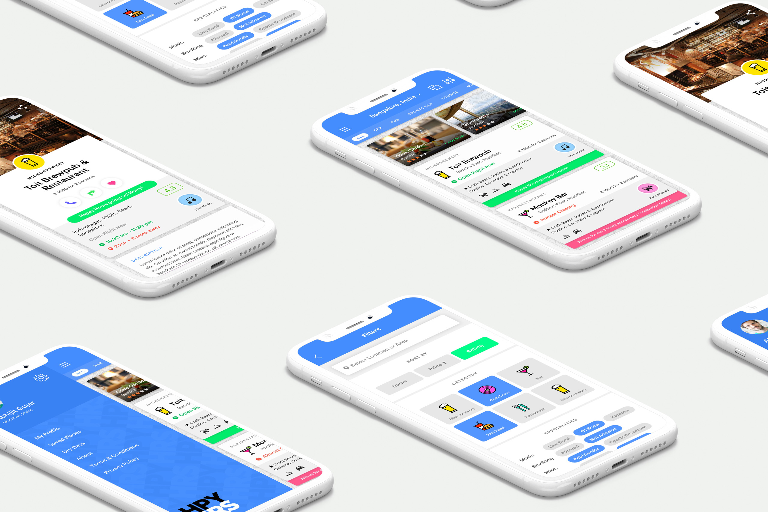
Where every hour is happy hour
- With Sukkrish Aadds
- Tags: Identity, Mobile, UI/UX
HPYHRS, as an app meant to solve two things – waste of time and disappointment among the young. This attitude was essentially in regard to the young being unable to locate a tea shop or liquor store that’s closest to their location.
With the intention of resonating with the young vibe, a brand identity which is youthful, bright and has a whimsical personality was conceived. The mood board reflected a myriad of vibrant colours, neon signages, glass reflections and muted pop art iconography.
The app interface followed a visual language based on cards, providing attention to detail for a multitude of elements across the application. The filters were a byproduct of extensive brainstorming and survey sessions dissecting the various metrics over which users make their choices.
HPYHRS is the gateway to the world of delight, curated for easy discovery. It focuses on experience, makes sure the content is easy to read and scannable, expediting the decision-making process. It goes by the mantra, ‘give users what they want – and a little more!’


Karam Dosa
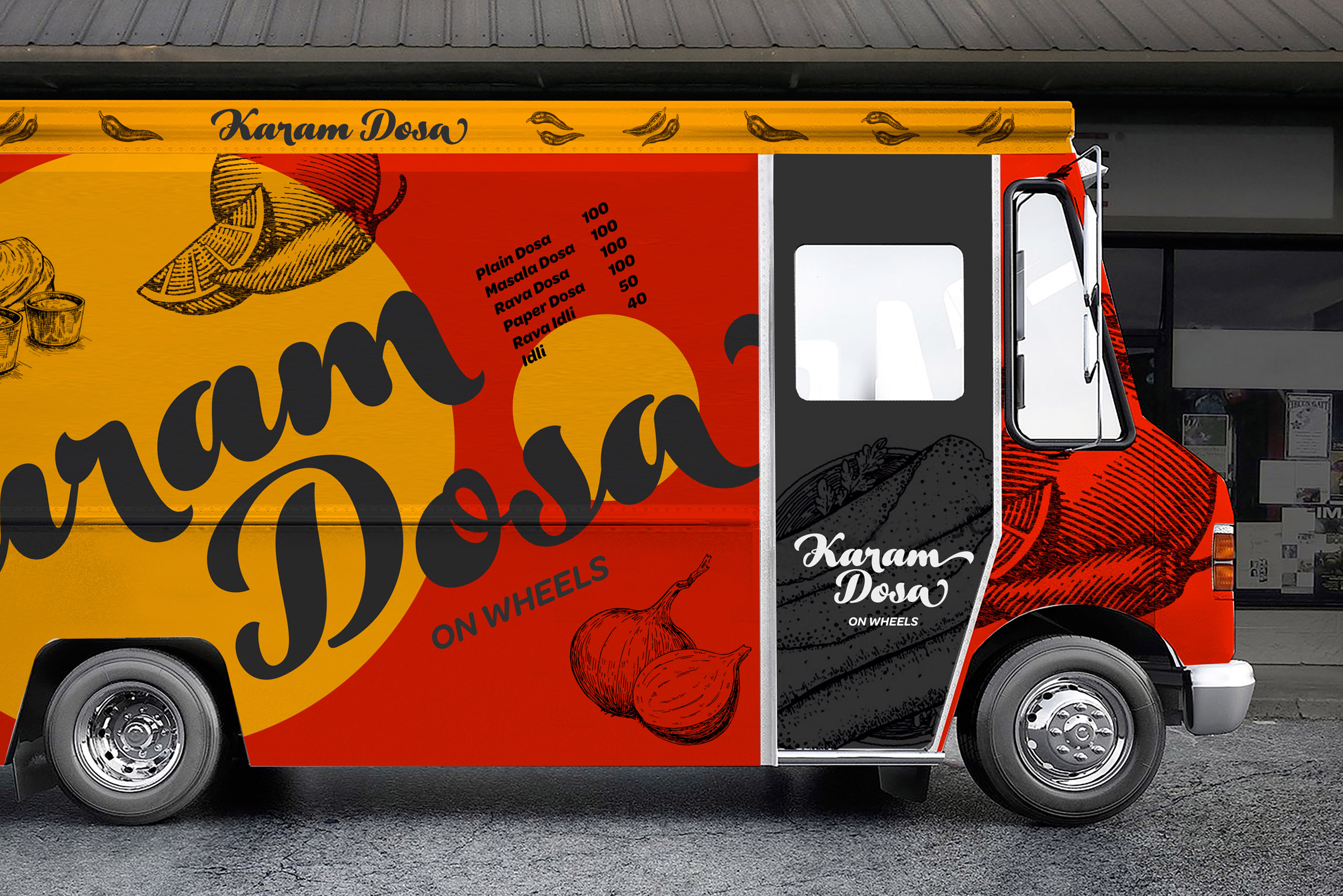
Branding a restaurant on
the move
- With Sukkrish Aadds
- Tags: Branding, Space Design, Packaging
There is a truck snaking through the streets of Bengaluru. Wherever it halts, people gather around it for ‘Karam Dosa’.
Dosa is one of the most popular breakfast options in the whole world! The task at hand was to design the identity for the spicy dosa brand that Karam Dosa is. A stunning visual language on the truck that makes a striking impact even in the traffic mayhem was our vision.
The design makes use of bright, contrasting colours – an indelible red and an exquisite yellow. As unmistakable as the Rayalaseema karam (spicy).


Sakra World Hospital
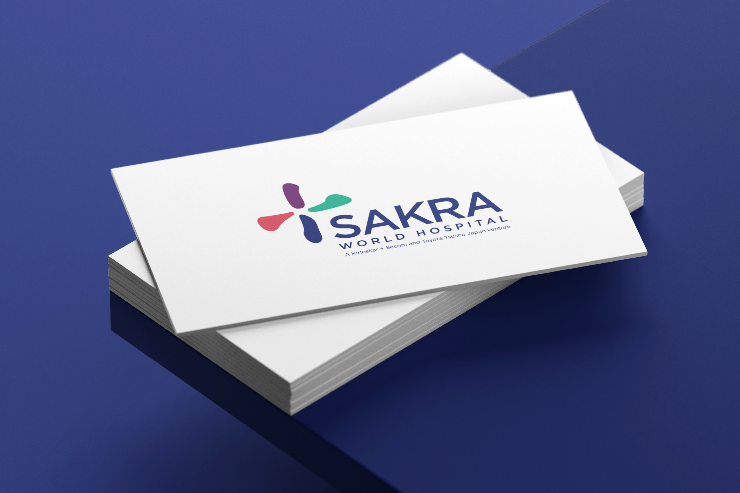
Branding an Indo-Japanese Hospital
- With Vyas Giannetti Creative
- Tags: Branding, Editorial, Wayfinding
Sakra World Hospital is a Bone, Joint, Brain and Heart specialty hospital in Bengaluru and marks the Kirloskar Group’s foray into Healthcare as well as VGC’s foray into Hospital Design Strategy.
Given the mandate that the logo must feature a medical cross and with the hospital being an Indo-Japanese venture, VGC conceived a unique visual symbol that captured the brand’s coming together premise within a Japanese cultural context.


Ajmera Nucleus
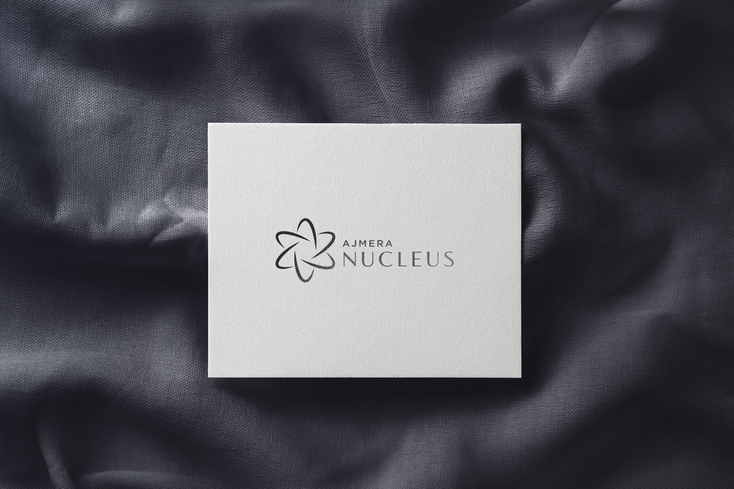
Creating an aspirational real estate brand
- With Sukkrish Aadds
- Tags: Branding, Strategy, Communication, Print
Nucleus – by Ajmera is a clutter-breaking, new-age real-estate project in Bangalore. The core idea for the design and strategy revolved around Ajmera’s aim to create the perfect living condition for techies working in Electronic City, and for them to have everything they hold dear around their homes (entertainment, office, malls and city-centre). This vision translated itself into the positioning of the brand – ‘at the core of life’.
The designs were disruptive. The tagline, for instance, features a professional, formal typeface that accompanies the first four words “at the core of” while the last word, “life” is presented in a jaunty, handwritten typeface and in a large size. It is bold and cheerful much like the brand and life itself.
View full case study on Sukkrish Aadds project page